In this blog post, we talk about the story behind our rebranding, but we also give you some specific tips and lessons we learned on our rebranding journey. They may come in handy if you’re thinking of doing a rebrand yourself!
Never change a winning logo … or should we?
Though it may seem that way, rebranding The Learning Hub did not happen overnight. To be honest, we’ve been playing with the idea for almost 3 years! Ever since we started noticing that our original look & feel brand did not reflect what The Learning Hub does anymore. Which is not that surprising, if you look at how we’ve evolved since The Learning Hub was founded in 2014!

To be honest, our original brand mainly consisted of a logo (a simple but clean merge of an ‘L’ for ‘learning’ and an ‘H’ for ‘hub’, embedded in a circle) and a basic color palette containing two shades of blue. It served us well at the time when we were a small start-up. However, as we evolved to a scale-up with a broader range of services, we craved a more colorful, meaningful visual style which represented The Learning Hub better.
Ready, set, go!
We embarked on our rebranding journey just like we do in the projects we work on. We involve our end users and we focus on the essence. In this case, this meant conducting a survey with our current and potential customers plus having a brainstorm session with all The Learning Hub co-workers. This revealed 3 core principles representing The Learning Hub …

… which form the foundation of our new branding. But, as we are more than just ‘3 core principles’, we needed 6 other keywords to fully describe us – and we wanted to visualize them somehow!
Open the tabs if you really want to get to know the The Learning Hub DNA.
Personality & personability
We all have our own unique personality, our own strengths and weaknesses. We adapt to those by working in teams as much as possible.
You won’t find many Plain Janes at The Learning Hub. What we have in common, is that we’re curious people who are eager to learn and passionate about what we do.
We’re also personable: we strive to be accessible and open in our contact with customers.
Close collaboration
Our ideal way of working entails a close collaboration: within our teams, between our teams, AND with our customers.
We aim for partnerships in which we think along with our customers and make them self-sufficient (while being available for help and advice). That’s why they keep coming back to us!
Transparent communication
We tend to interact with each other and with our customers in an informal way. To build a solid relationship, we value open and transparent communication. There aren’t many things happening behind the scenes that our customers don’t know of – we don’t let issues escalate and prefer a pro-active approach.
The bigger picture
Even though we always focus on the core question of a project, it’s in our DNA to initially take a step back and look at things from a broader perspective. We take our 3 pillars (content creation, LMS and training design) into account during the analysis phase of each project.
Agile & Scrum
Working together successfully demands flexibility as well as structure. Years of experience in managing projects and teams have led us to our current way of working, based on the agile principles and the scrum framework.
Each team has a Product Owner and a Scrum Master. We split up our projects into specific User Stories and plan them out over weekly Sprints. Retrospectives, daily stand-ups and sprint planning meetings are part of our routine.
Last but not least: fun
We consider ourselves true professionals, but that doesn’t mean it’s all work and no play. It’s important to blow off some steam once in a while! We do that by adding a fun touch in our projects, by getting together at internal events organized by our Fantastic Fun Team, or by sharing a laugh – the silliest day-to-day things or stupidest inside jokes just may be the funniest!
Core principles – check! But … how do you build a visual style from them?
And now, the specifics! How do you make these ‘core principles’ and ‘keywords’ come to life? Here are some examples of how they are reflected in our visual style:
Color palette
We chose a wide, varied, colorful palette containing bold shades of yellow-blue-green and fuchsia, to show the wide range of services we offer and industries we work with (the bigger picture). They are vibrant colors with even a ‘flashy’ side to them (personality/personability & fun).

Gradients
For us, a gradient, where one color blends seamlessly into another one, represents a smooth flow or transfer. For example: how we integrate the content we created for you seamlessly into your Learning Management System and your organization (the bigger picture). How we strive for a smooth transfer of what people learn in our courses to the work environment (didactics). Or how we work together in a nice flow, internally AND with our customers (close collaboration, agile & scrum).

Fonts
As our main font, we chose a sans serif font with a modern, clean look (quality): Segoe UI. This is a web safe font installed by default on (almost) every device, so we don’t risk running into loading problems or readability issues.
We pair our basic font with a more signature one that is called Arkipelago. With its hand-drawn look, it shows our creative side (tailor-made) and makes us stand out from other brands!

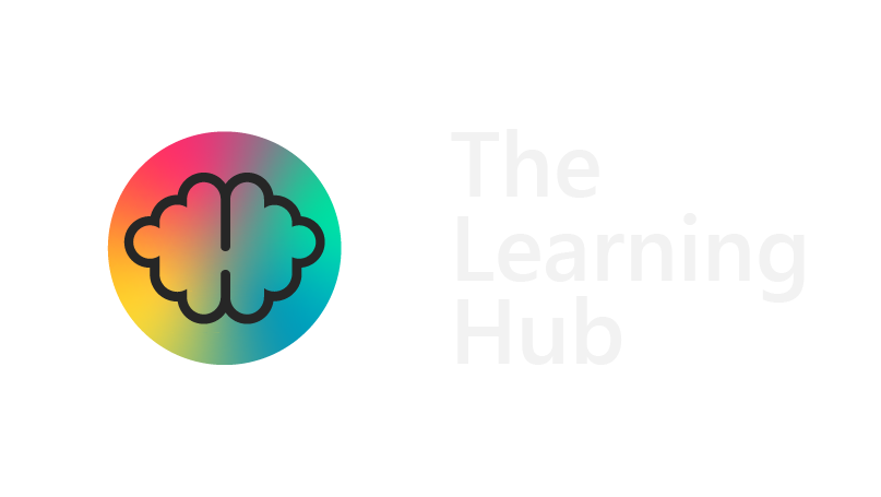
Logo
Our logo is a clean and crisp (quality) but round and playful (fun) representation of the brain, where learning takes place (didactics).

Lessons learned
Rebranding our company has been a wild ride and we’ve learned a lot along the way! For those of you who are considering your own (re)branding, we are happy to share some of our lessons learned.
Tip 1
During the (re)branding process, keep a list of things you come across with your logo. For example, your social media accounts, company presentations, Office templates, print items like stickers or gadgets, but also:
-
-
-
- other websites referring to you and showing your logo (partners, providers …)
- your company background for online meetings (e.g. Teams or Zoom background)
- your invoices
- any tools you use internally, like project management tools, timesheets … Even if it is ‘just’ internal stuff, it is still important for employees to not be confronted with the old branding anymore, as soon as you’ve made the transition.
-
-
Tip 2
Make sure all co-workers are on board! Communicate about the (re)branding process. Create an elaborate but clear brand guide, containing instructions on:
-
-
-
- when to use which version of the logo (black & white vs. color, with vs. without tagline …)
- when to use which font, if you have more than one signature font. Keep in mind that some fonts need to be installed on people’s devices for them to see and use it correctly!
- the type of photography that suits your visual style (colorful photos, grayscale, sepia tones …)
-
-
Remember to adapt the brand guide if you notice people consistently making the same mistakes. Maybe you can add more examples of ‘good practices’ to make the visual style you are going for, even clearer.
Tip 3
If you can, include your co-workers in the (re)branding process. Some ideas we used:
-
-
-
- Have your co-workers vote on proposals, or have each team choose a color – like we did. And take the results into account, of course!
- Ask them to keep an eye out for items that need to be (re)branded: some co-workers may come across templates or presentations that the people working on the rebranding don’t even know exist.
-
-
Interested in hearing more tips & tricks? Want us to help you (re)brand your learning materials?